The stained-glass of Bourges Cathedral
Saint-Étienne Cathedral, Bourges.
Since July 11th I’ve been staying in my house in the northern Allier region of France. Obviously, it’s always quite a culture shock to come back here after months in Korea. But rather than try to grapple in this post with some of the thoughts crashing around in my head, I thought I’d introduce a wonderful masterpiece.
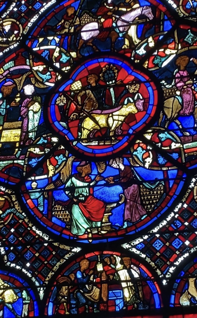
Just up the road from the village where we have our house is the city of Bourges which has a cathedral named after Saint Étienne. It was built in the late twelfth to early thirteenth century in the early Gothic style. For me, the stained-glass windows around the ambulatory is one of the greatest works of art anywhere. Amazingly, 22 of the original 25 medieval windows have survived. Here are very inadequate photographs I took to give you some idea:
As the later windows one can see in Bourges’ Cathedral attest, the art of stained-glass was already extinct by the Renaissance, a salutary reminder that art media are closely related to wider cultural necessities. However hard modern artists have tried to make stained-glass for churches - Gerhard Richter’s window in Cologne Cathedral comes to mind, it is simply a fact that this medium is no longer potently contemporary. Here’s Richter’s work:
What I find especially satisfying in the Bourges’ stained-glass is that each window works on three distinct but interrelated levels. As you approach, you are first aware of the intricate and dazzling pattern produced by the tiny pieces of different coloured glass. Then, as you looks more consistently, you become aware of the division of the windows into symmetrical, geometric patterns. As you move up closer, you come to focus on the imagery and recognize (sometimes, anyway) the Biblical narratives narrated on each window.
This means you accumulate the contrasting aesthetic experiences of multicoloured and formless light and then the harmonious linear pattern. These experiences are then supplemented by the more discursive experience of reading the symbols and stories. But, of course, this transition doesn’t happen in strict linear succession, and you can flip back and forth between the levels as you move around in front of the stained-glass. That’s a pretty satisfying experiential ‘package’, one that spans a wide range of affective and cognitive skills.
*
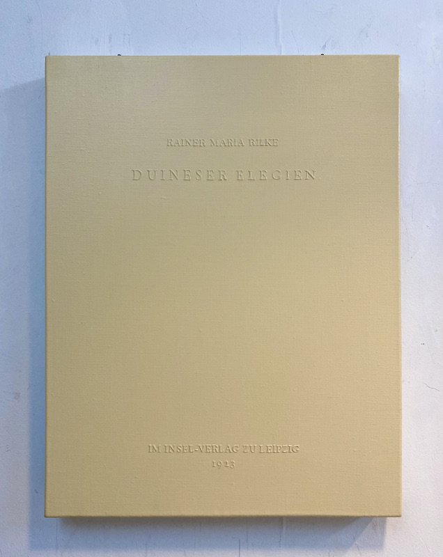
I realize that I try to achieve something similar in my own Book-Paintings. Here are some recent works. A book in German of Rainer Maria Rilke’s poetry collection ‘Duiner Elegein’ and one in French of Albert Camus’ ‘La Peste’. They are both 46 x 38cn, acrylic on canvas. Ther text is built up into relief and painted a very slightly different tone to the ground. In these cases, it is copied from the title pages of the original books:
As you approach the paintings from a distance, you at first see just a single coloured rectangle. The colours can be drawn from the original cover of the book or from an association I feel between the colour and the content of the book. As you move in closer you can make out the letters on the surface, which because they are in relief, cast a shadow on the surface. The text connect the painting to a specific book from which I have copied the typography and layout. You then read the painting and make associations to a work of literature and historical context. This means you move from a primarily sensory experience to a more cerebral one.
The word ‘move’ is crucial, because what this implies an animated relationship to the painting, as is also the case in relation to the Bourges’ stained-glass. For me, this animation, in which experiencing a painting means also engaging with through physical movements, movements, allows one to shift back and forth between different levels of response, is really important, as it works against the static idea of detached contemplation, which separates one from the thing contemplated.
Here are some more recent works, photographed in my Korea studio, made for a forthcoming show in London. The source of the two nearest paintings are monographs on British artists from the 1940s, published by Penguin. I played with the fact that the original design bisected the surface horizontally. The smaller works are derived from a novel by Virginia Woolf - ‘To the Lighthouse’ - and by D.H. Lawrence - ‘Sons and Lovers’. As you can surmise, the theme of the show is ‘Modern British’ art and literature.
NOTES
The photo of the Richter window is a screen grab from: https://www.design-is-fine.org/post/68822009029/gerhard-richter-cologne-cathedral-window-2007


